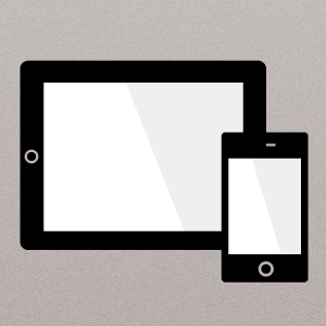
[CSS]iPad、iPhone 5 向けレスポンシブWEBデザインに必要な Media Queries のまとめ
スポンサード
スポンサード
レスポンシブWEBデザインへの対応で頻繁に使うCSS の Media Queries ですが、条件分岐のやり方をよく忘れるので整理しました。
「iPad」「iPhone」「iPhone 5」の端末別に加えて、「ブラウザ幅」での条件分岐もまとめています。
目次
横向き、縦向き
横向き
@media only screen
	and (orientation:landscape) {
}
縦向き
@media only screen
	and (orientation:portrait) {
}
端末別(iPad、iPhone)
iPad 横向き
/*1024px*/
@media only screen
	and (min-device-width:768px)
	and (max-device-width:1024px)
	and (orientation:landscape) {
}
iPad 縦向き
/*768px*/
@media only screen
	and (min-device-width:768px)
	and (max-device-width:1024px)
	and (orientation:portrait){
}
iPhone 5
/*568px*/
@media only screen
	and (min-device-width:320px)
	and (max-device-width:568px) {
}
iPhone 横向き
/*480px*/
@media only screen
	and (min-device-width:320px)
	and (max-device-width:480px)
	and (orientation:landscape) {
}
iPhone 縦向き
/*320px*/
@media only screen
	and (max-device-width:320px)
	and (orientation:portrait){
}
高解解像度用
@media only screen
	and (-webkit-min-device-pixel-ratio: 2) {
}
ブラウザ幅での条件分岐
/*1024px*/
@media screen
	and (max-width: 1024px) {
}

/*768px*/
@media screen
	and (max-width: 768px) {
}

/*480px*/
@media screen
	and (max-width: 480px) {
}

/*320px*/
@media screen
	and (max-width: 320px) {
}
スポンサード


コメント