[CSS]CSS3 のborder-radius で角丸を作る方法
スポンサード
値の組み合わせ方次第で「上辺」のみを角丸、「下辺」のみを角丸 なども可能です。
スポンサード
CSS3 より border-radius のプロパティを使う事で簡単に角丸のオブジェクトが表現できるようになりました。
今回は border-radius を使って様々な角丸のサンプルを紹介したいと思います。
目次
border-radius の記述方法
border-radius の値について
border-radius は以下のような記述をします。
.box   {
    -webkit-border-radius:10px 10px 10px 10px;
    -moz-border-radius:10px 10px 10px 10px;
    border-radius:10px 10px 10px 10px;
}
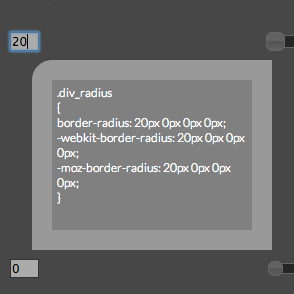
値は、「左上」「右上」「右下」「左下」の順に記述します。-moz- や -webkit- などの「ベンダープレフィックス」合わせて記述しておきます。1辺の値を省略
以下のように1辺の値(左下)の値が省略された場合は、「右上」の値(以下のサンプルだと 5px )が適用されます。margin:10px 5px 10px のように値が省略されるイメージと同じです。
.box   {
    border-radius:10px 5px 10px;
}
1辺のみ値を記述
以下のように、値が1つの場合は4つの角が全て 10px の角丸になります。margin:10px のように値が省略されるイメージと同じです。
.box   {
    border-radius:10%;
}
四隅を角丸にする記述例
「左上」「右上」「右下」「左下」の四辺を角丸にするサンプルです。
.box   {
    -webkit-border-radius:10px 10px 10px 10px;
    -moz-border-radius:10px 10px 10px 10px;
    border-radius:10px 10px 10px 10px;
}
以下のように省略して記述することも可能です。
.box   {
    -webkit-border-radius:10px;
    -moz-border-radius:10px;
    border-radius:10px;
}
サンプル
サンプルはこんな感じです。(※IE8 以下では見れません)四隅を角丸にする
「左上」のみ角丸にする記述例
今度は「一辺のみ」角丸にする記述例として、まずは「左上」のみ1辺を角丸にする記述例です。
.box   {
    -webkit-border-radius:10px 0 0 0;
    -moz-border-radius:10px 0 0 0;
    border-radius:10px 0 0 0;
}
以下のように、border-top-left-radius と左上に絞って記述することもできます。
.box   {
    -webkit-border-top-left-radius:10px;
    -moz-border-top-left-radius:10px;
    border-top-left-radius:10px;
}
サンプル
「左上」のみ角丸にする
「右上」のみ角丸にする記述例
「右上」のみ1辺を角丸にする方法です。
.box   {
    -webkit-border-radius: 0 10px 0 0;
    -moz-border-radius: 0 10px 0 0;
    border-radius: 0 10px 0 0;
}
以下のように、border-top-right-radius と右上に絞って記述することもできます。
.box   {
    -webkit-border-top-right-radius:10px;
    -moz-border-top-right-radius:10px;
    border-top-right-radius:10px;
}
「右上」のみ角丸にする
「右下」のみ角丸にする記述例
「右下」のみ1辺を角丸にする方法です。
.box   {
    -webkit-border-radius: 0 0 10px 0;
    -moz-border-radius: 0 0 10px 0;
    border-radius: 0 0 10px 0;
}
以下のように、border-bottom-right-radius と右上に絞って記述することもできます。
.box   {
    -webkit-border-bottom-right-radius:10px;
    -moz-border-bottom-right-radius:10px;
    border-bottom-right-radius:10px;
}
サンプル
「右下」のみ角丸にする
「左下」のみ角丸にする記述例
最後に「左下」のみ1辺を角丸にする方法です。
.box   {
    -webkit-border-radius: 0 0 0 10px;
    -moz-border-radius: 0 0 0 10px;
    border-radius: 0 0 0 10px;
}
以下のように、border-bottom-left-radius と右上に絞って記述することもできます。
.box   {
    -webkit-border-bottom-left-radius:10px;
    -moz-border-bottom-left-radius:10px;
    border-bottom-left-radius:10px;
}
サンプル
「左下」のみ角丸にする
値の組み合わせ方次第で「上辺」のみを角丸、「下辺」のみを角丸 なども可能です。
スポンサード
このカテゴリとの関連記事
 [CSS]border-radius などのコードをWEB上で簡単に生成できる「CSS3 Generator」
 [IE]IE6、IE7、IE8 で角丸やドロップシャドウなどを利用できる「IE-CSS3.htc」
 [IE]PIE.htc を利用したIE8 以下向けの表示サンプル
- [CSS]CSS で円形、三角形、台形、星形 などを表現する方法のまとめ
 [CSS]ボックスに影を付ける(ドロップシャドウ)CSS のプロパティ「box-shadow」
 [CSS]-webkit-box-reflect による鏡面効果の設定方法とAndroid への対応方法
 [CSS]テキストに影を落とすCSS3 のプロパティ「text-shadow」
 サイトのコピーライトで「現在年」を表示する方法(Javascript & PHP)
 [JS]ブラウザを一定量スクロールさせるとボタンを表示させて固定させるカスタマイズ


コメント